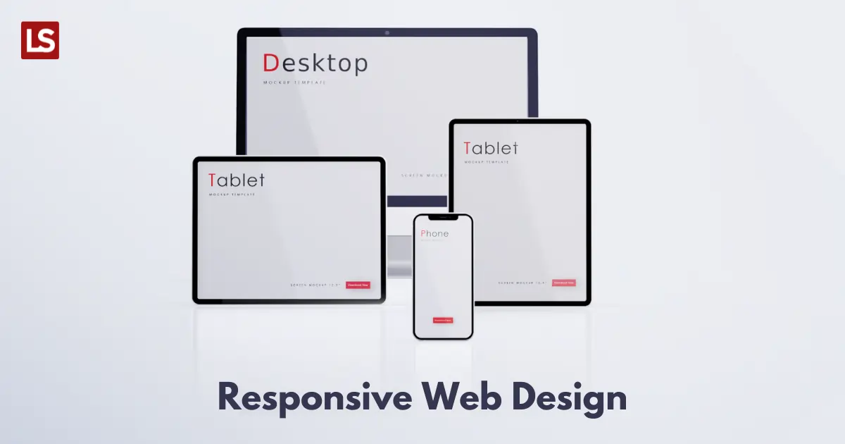
Responsive design refers to an approach that enables a single site to go well with different devices and screen sizes and ensure usability. No matter from which device users access your website – a mobile, desktop, laptop, or tablet, the web pages will change the appearance and render differently according to the device or screen size used to view the web.
Why is Responsive Design Needed?
Nowadays, most people prefer their mobile devices to use any websites or apps and their approach for your platform is no different. This is the basic need of today’s users and the reason for you to use the RWD for your web app development.
Changing as per the users’ preferences based on screen size and platform, a responsive design could solve many issues related to your web experience. Have a look at the following points:
A responsive design automatically scales your web content and elements to meet the screen size on which it is viewed and prevents you to deliver an uneven experience to your users using it on multiple devices.
Reducing the unnecessary resizing, zooming, and scrolling efforts of the users, It improves the way your website looks on different devices including small to mid and big size screens and delivers a seamless view and performance across devices ensuring an optimal experience.
Even Google prefers responsive web design over all the other designs. It is indeed a significant ranking factor in your web SEO but, how?
As a responsive design could make your website more appealing to view and much easier to navigate, It ultimately results in enhanced user experience and an extended time on site.
And because Google recognizes ‘time on site’ as the main indicator of user experiences analysis, your chances to get a higher ranking or get rewarded by Google increases with responsive design.
Another reason to embrace a responsive design is, It avoids the need for a mobile app. Yes, If you have a responsive design you don’t need to develop a separate app for mobile users as it already supports all the screen sizes.
As per Good Firms Recent Report, 73.1 % of respondents (mostly designers) indicated that a non-responsive design is among the top reasons why users leave a website. In fact, a non-responsive design may lead you to lose up to 90% of your potential customers and your brand value too.
How Does it Work?
There are majorly three structures that drive responsive design: flex, grid, and fluids. These structures automatically adjust themselves according to the device resolution and screen size and change the appearance of the page on different platforms. Responsive design enables the web page elements to reshuffle as the users’ viewports grow or shrink.
Let’s Find Out the Major Benefits of Using RWD:

Positive User Experience
As per Quoracreative statics, almost 63% of people access Google and Internet via smartphones. And, If your website is not a responsive one, It will not be easy to navigate on mobile devices for users. This means you will more likely to lose more users on mobiles.
So, If the majority of users are preferring mobile phones to access your website, you need to make sure you provide them with an easy navigation experience with a responsive design. While a responsive design makes website navigation easier, easy navigation makes users conveniently find what they are looking for on your website. All this will ultimately leave a positive and enhanced experience for your web users.
Lower Bounce Rates
Loading time could have a huge impact on the bounce rate of any website. As per the stats, website bounce rates on mobile devices are approx 40%, wherein, the quick loading time could get you 70% longer viewing sessions.
If you have a responsive web design, your web pages will load faster in comparison to a non-responsive website regardless of the device and screen size. So, having a responsive design could lower your website bounce rate and could make visitors stay longer on your web pages.
Improve Brand Value
A report by Quoracreative depicts that 61% of people have a better opinion of the companies that offer a good mobile experience and another report says 57% of users don’t consider and recommend a business with a poorly-designed mobile website. A non-responsive design could disappoint and even irritate your visitors with a poor browsing experience and leave an extremely negative impression of your brand on them.
On the other hand, making browsing seamless, easy, and quick, a responsive website could deliver an experience that is not just positive but leaves a lasting impression on them, and that creates trust among the users and improves your brand’s value in the market.
Social Sharing & SEO Gains
Google prefers responsive design for SEO ranking over separate mobile templates sites because a responsive website offers more flexibility and convenience to the users and Google is all about customer experience. Another significant benefit of a responsive design is boosted social sharing as it is designed to make social sharing easy for all devices: mobiles, tablets, or desktops.
Though it won’t have a huge and direct impact on your web ranking, it will for sure enable you to expand your audience base. An expanded user base means, you are going to have greater traffic and engagement on your site and it will lead your brand to get into Google’s notice with more search demand.
Responsive Adapts to Future Devices
Because a responsive design’s template is created based on the screen size and not as per the device size, it enables users to view your web platform from any device without any inconvenience of zooming in and out or resizing.
It means, your website will be ready to adapt to the new devices launching in the future without compromising its look. It will still deliver a beautiful and seamless view to your users regardless of the devices are new or old.
Conclusion
With mobile-first vogue at its peak, It has become a necessity for businesses to provide their users with a mobile-friendly experience. To stand out in today’s crowded digital space, you need to understand the latest technologies and trends in web design, as well as users’ preferences, behaviors, and expectations, and develop a responsive web design accordingly.


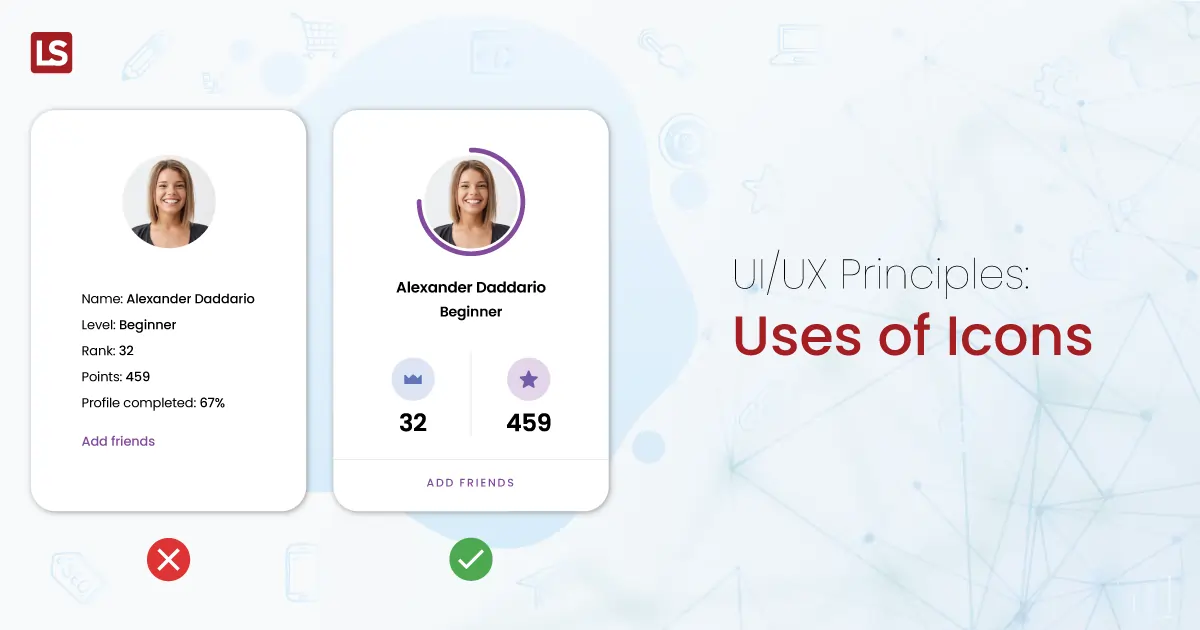