Icons are the graphical symbols to present the purpose of action on any device; Windows, Android, iOS, or any device. Icons are available everywhere in the digital space, and play an influential role to depict functionalities of a platform or application
Icons, whether used for mobile applications or web applications should be clear, elegant and should stand apart. Designing icons leads to a great user experience wherein users can understand their purpose.
Icons should be pleasing to the eye, lucid, and effortless to make them speak to the user directly.
Tips for incorporating icons into your SaaS as per ux/ui design principles
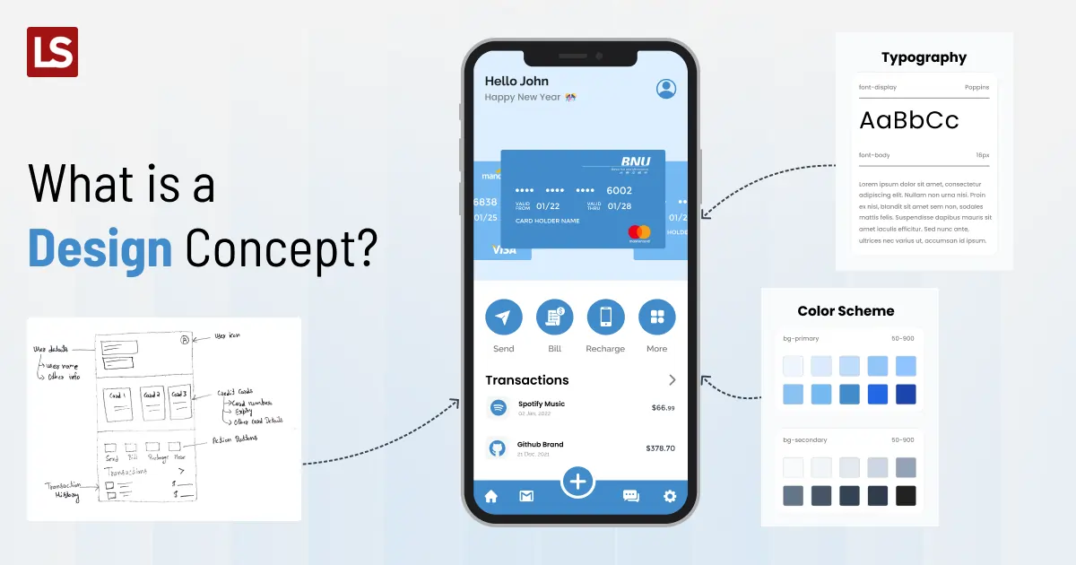
When it comes to developing a SaaS (Software as a Service) product, paying attention to the user experience (UX) and user interface (UI) is paramount. Icons play a crucial role in enhancing the overall UX/UI design. They serve as visual cues and navigation aids, making the user’s journey smoother and more intuitive. To ensure your SaaS product’s success, here are some best practices and design principles for UX/UI when incorporating icons:
1. Clarity and Consistency
Icons should convey their purpose clearly and consistently. Avoid ambiguity by using universally recognized symbols or custom icons with straightforward meanings.
2. Simplicity
Keep icons simple and uncluttered. Overly complex icons can confuse users. Strive for a minimalist design that conveys the message efficiently.
3. Size and Scalability
Ensure icons are appropriately sized and scalable across different devices and screen resolutions. Scalable vector graphics (SVG) are an excellent choice for this purpose.
4. Color Palette
Use a consistent color palette to maintain visual harmony. Colors should align with your brand identity while considering accessibility standards.
5. Hierarchy
Establish a visual hierarchy using icons. Important actions or features should have more prominent or distinctive icons to draw user attention.
6. Feedback and Interactivity
Icons should provide feedback upon interaction, such as changing color or animation. This informs users that their action has been registered.
7. User Testing
Conduct user testing to gather feedback on icon usability. Adjust designs based on user preferences and pain points.
8. Adaptation to Context
Icons should adapt to the context in which they are used. They should blend seamlessly with the overall UI design.
9. Accessibility
Ensure that icons are accessible to all users, including those with disabilities. Use alt text for screen readers and maintain adequate color contrast.
10. Documentation
Create a style guide or documentation for icon usage within your SaaS product. This ensures consistency across the development team.
Incorporating these best practices and design principles for icons in your SaaS product’s UX/UI will not only enhance user satisfaction but also contribute to the product’s overall success. Remember that effective icon design is an integral part of creating a user-friendly and visually appealing SaaS application.
To add more to the above context, let us walk through the detailed section on UI/UX design principles and learn how to use icons appropriately.
Your Icons Should Be Communicative
Icons are like a universal language in the digital world. They convey actions and functions across various devices and platforms. Familiar icons such as home, call, search, or edit have established themselves as instantly recognizable symbols. When designing icons, aim for clarity and coherence to ensure users can intuitively understand their purpose. In some cases, when your UI is well-crafted and your icons align with user expectations, you may not even need accompanying text. Remember, icons should communicate directly with the user.
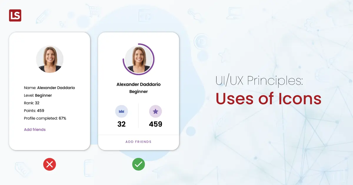
Your Icons Should be Consistent
Styling and designing are twins. They appear different but if done coherently, the aftermaths are brilliant. Assuming you are keeping the user interface in mind and drawing the most stylish icons library but not keeping the design concept equivalent, it may bring a disaster to all of your efforts. Contradictory design and style are a bad idea in the hope of creating something out of the box.
Consistency is key in UI/UX design. Icons should seamlessly integrate into your overall design language. Maintain uniformity in terms of colors, fonts, and layouts across your icon library. Avoid altering universal icons from established libraries like Font Awesome or Material Icons. While creativity is encouraged, ensure a delicate balance between innovation and consistency.
Your Icons Should Be Simple and Schematic

Icons should be scalable

Use Icons Sparingly
Test The Icons With The Users
Regardless of how much work you put into developing your user interface, you should always evaluate its usability. User testing will show you any usability problems with your UI and enable you to determine whether the icons you’ve picked are clear to your target audience.
User testing is a critical step in ensuring icon usability. Icons are often the first interaction users have with your SaaS app, making it imperative to test them thoroughly. User feedback helps identify usability issues and ensures that your chosen icons align with your target audience’s expectations.
By running through the feedback loop of asking for the user’s input and then using that feedback to improve your design, you can make sure that your icons are on track and working as intended.
Conclusion
Icons are highly beneficial elements in designing the user interface of a SaaS product. They visually represent a function and inspire users to take certain actions. Designers should not only choose the best icon but also use it appropriately adhering to best practices design principles ux/ui.
While this article provides a solid starting point, remember that icon design is a dynamic field, and staying current with trends and user preferences is essential for success in your design endeavors. So, incorporate these principles, stay adaptable, and best of luck with your upcoming projects!