
The mobile trend started to emerge in early 2014 and as per many studies, since then it has been growing only. One such research depicts, in 2020 smartphones brought 61% of visits to the U.S. websites which is clearly up by 57% from the last year – 2019.
In 2016 there were reports that stated total global internet browsing on mobile surpassed desktop browsing. This is where the concept of digital design took a new turn and people started to notice the significant difference between mobile and desktop designing.
Today, with more and more users using mobile apps to browse websites, mobile apps have more likely eclipsed usage for desktop. Here in this article, we will discuss some Important Factors That Impact Your Mobile App’s UI / UX.
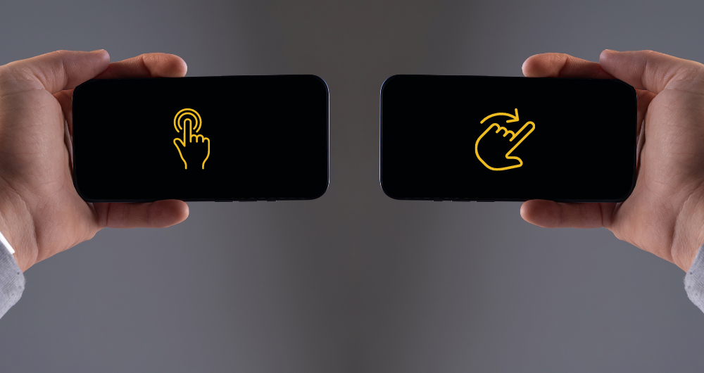
Tappable vs. Clickable Interactions
Desktops have cursor interactivity hence, the desktop apps can enable users to features like hover text or cursor-triggered animations. Providing desktop apps to have an interactive screen that has more visuals including descriptive text that appears only when a user hovers over it.
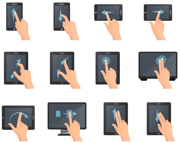
On the other side, users can’t hover or rollover on the elements on mobile apps, but they get a lot more than that like huge gestures or touch screen options literally at their fingertips. Features like swiping and shaking make using the app more fun than desktop apps and also bring a whole new set of opportunities for businesses to grow.
As most of the people today prefer to use smartphones and these mobile devices are broadly touchscreens, It obviously makes a significant difference in how people interact with them. Here, they tap their screen and gesture to interact with the UI elements and not a cursor to click. It is among one of the significantly important factors that needs to be considered in designing of any mobile app.
Dropdown Menus
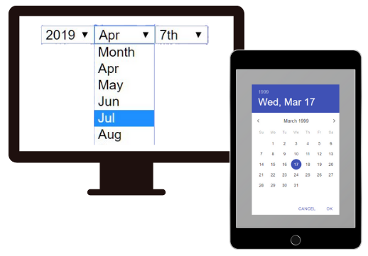
Dropdown menus are among the central differences between a mobile app and a desktop app. Being a significant UI component for navigation, Dropdown menus can be seen almost everywhere on a website and an app.
They mostly function well with desktop apps because of the large screen space available for the design. On the other hand, designing dropdown menus can be quite challenging for mobiles as mobile screens are comparatively smaller in size.
Hence, these menus are generally used where more relevant and simpler control elements would work easily. Let’s understand this with an example while filling an online form on your smartphone if you are getting dropdown menus for each and every question requiring multiple taps and lots of scrolling, how would you rate that app experience?
Obviously Bad!!!
Date range picker is a good fit for such scenarios. Instead of selecting dates through a complicated dropdown menu, It creates an easy-to-use dropdown menu that enables users to select a range of dates with fewer taps. While offering fewer taps functionality and working really well on mobile devices, the Date range picker could save a good amount of time for the users.
Content Organization
As mobile phones have smaller screens it means they already have limited room for content, text, and graphics. Hence, it is important for designers to organize the content as per the design priorities. They can do that by avoiding large content and extra graphical approaches.
Desktop apps have the advantage to use the content with maximum flexibility including several designing layouts and implementing a wide range of text and images.
To meet the needs of mobile app users designers may need to follow a systemized visual and typography hierarchy. Content scrolling can be another approach to keep the users engaged with your app but, only when you make it a fun practice with more interactive gestures.
While desktop apps majorly support landscape orientation, mobile apps can switch between portrait and landscape views at will. This switching feature brings in more functionality and better customization, but it needs almost double design efforts.
Mobile devices have a small screen size which means a lot more than the opportunity to add more stuff. Screen size affects all aspects of design, especially navigation.
According to an analysis on navigation styles by UX Matters, 90% of mobile platforms leveraged vertical navigation when the desktop apps were more likely to rely on horizontal navigation.
Hence, it is clear vertical orientation is better suited to mobile applications over horizontal navigation. Focused on on-site content, horizontal navigation becomes a good choice for desktop apps wherein vertical navigation creates an enhanced and user-friendly experience for mobile app users.
Prioritize The Important Elements
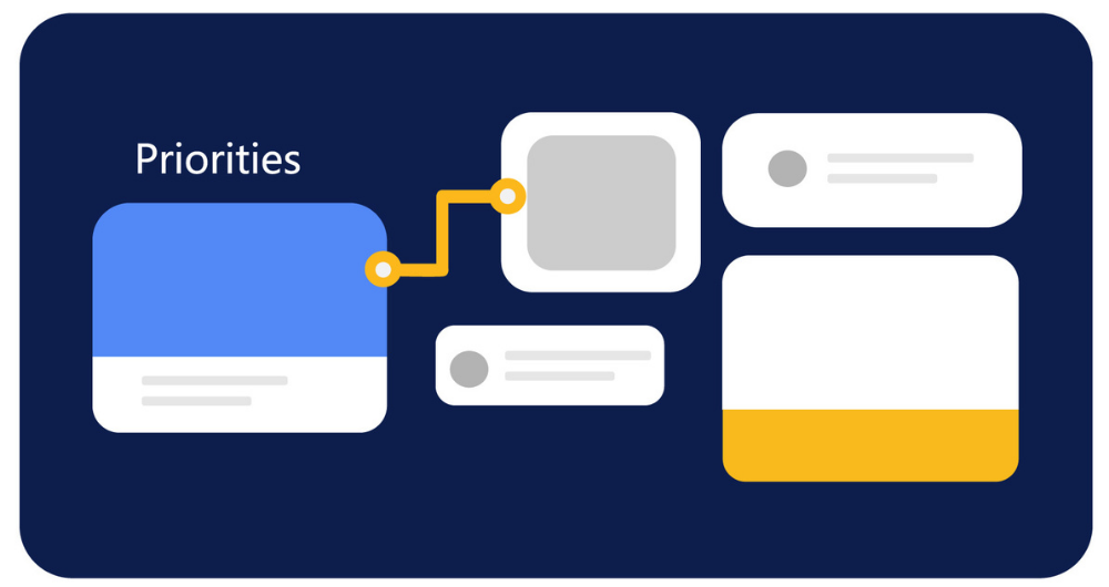
As the screen size is among the major differences between the two desktop and mobile, you need to consider all the elements related to that. A smaller screen means limited opportunities for using text, graphics, and other UI elements.
To design your mobile app’s pages well, it is very important for your designers to prioritize critical UI elements. You can simply do that with a strategic design plan or a design checklist.
Understanding What Users Want
Today’s modern users don’t have much time to spend on a slow-loading app, hence, you must understand what people want in this digitally competitive space.
Users want to have a great experience in minimal time especially when it comes to mobile devices. So the design of the mobile app needs to be simpler and straightforward. If you want to add complex features, then add them on the desktop version.
Integration With Phone Functions
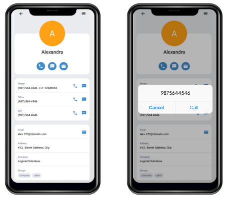
One of the most important things in designing is integration with phone functions because it enables the users with maximum ease to operate like direct calling, messaging and location sharing services. This kind of advanced features and functionalities makes your app’s experience more tailored to the modern users’ preferences and they feel more connected with your product.


